set the parent a position property of relative:
.parent {
position: relative
}
This set an anchor so that all sons of this parent will set their absolute position values as an offset to this parent.
set the child element the following properties:
.child {
position: absolute;
top: [top]
left: [left]
}
Sunday, 6 July 2014
Tuesday, 1 July 2014
style tag vs. all.css vs. many custom.css
Think about:
network transport
fast vs. slow developement
managing one big file that has many sections and affects many screens
network transport
fast vs. slow developement
managing one big file that has many sections and affects many screens
Saturday, 28 June 2014
CSS 3 reset css
input[type="text"],
input[type="email"],
input[type="tel"],
input[type="number"],
textarea {
-webkit-appearance: none;
-moz-appearance: none;
-ms-appearance: none;
appearance: none;
outline: 0;
box-shadow: none;
}
input[type="email"],
input[type="tel"],
input[type="number"],
textarea {
-webkit-appearance: none;
-moz-appearance: none;
-ms-appearance: none;
appearance: none;
outline: 0;
box-shadow: none;
}
CSS 3
reset.css
input[type="text"],input[type="email"],
input[type="tel"],
input[type="number"],
textarea {
-webkit-appearance: none;
-moz-appearance: none;
-ms-appearance: none;
appearance: none;
outline: 0;
box-shadow: none;
}
:focus
sets styles for the field currently being used:
input:focus,
textarea:focus,
select:focus {
background-color: #eef;
}
:checked
input:checked ~ label {font-weight: bold;
}
alternatively:
:not(:checked)
~ Selector
find siblings:input:checked ~ label {
font-weight: bold;
}
:indeterminate
:required
:required applies styles to any input that has a required attribute and must be entered prior to submit.:optional
:optional applies styles to any input that does not have a required attribute. I’m not sure why it’s been added since :not(:required) would do the same?!:valid
:valid applies styles to any input that currently holds valid data.:invalid
Similarly,
:invalid (or :not(:valid)) applies styles to any input that currently holds invalid data,:in-range (number and range inputs)
Numbers and ranges holding a valid value between the
min and max attributes that adhere to the step value can be selected using :in-range. Obviously, it’s a little difficult for a slider to be out of range, but…:out-of-range (number and range inputs)
:out-of-range targets invalid number values for range inputs.:disabled
Inputs with a
disabled attribute can be targeted with the :disabled pseudo-class, e.g.
1
2
3
4
| input:disabled { color: #ccc; background-color: #eee;} |
Remember
that disabled fields will not be validated or have their data posted to
the server. However, styles for pseudo-classes such as
:required and :invalid will still be applied.:enabled
Similarly, non-disabled fields can be selected with
:enabled (or :not(:disabled)). In practice, you’re unlikely to require this selector since it’s the default input style.:read-only
Inputs with a
readonly attribute can be targeted with the :read-only pseudo-class.
Remember that read-only inputs will still be validated and posted to
the server but the user cannot change the values.:read-write
Standard read-write fields can be selected with
:read-write (or :not(:read-only)). Again, it’s not a selector you’ll need often.:default (submit buttons or inputs only)
Finally, we have the
:default selector, which applies styles to the default submit button.Placeholder Text Style
The
placeholder attribute text can be styled using the ::placeholder pseudo-element with vendor-prefixes (in separate rules), e.g.
1
2
3
4
| input::-webkit-input-placeholder { color: #ccc; }input::-moz-placeholder { color: #ccc; }input:-ms-input-placeholder { color: #ccc; }input::placeholder { color: #ccc; } |
******************************************************************************
******************************************************************************
******************************************************************************
******************************************************************************
******************************************************************************
******************************************************************************
******************************************************************************
******************************************************************************
******************************************************************************
input[type=search] { -webkit-appearance: none; }
input[type=text] {
  -webkit-appearance: searchfield;
}
WebKit values
- checkbox
- radio
- push-button
- square-button
- button
- button-bevel
- listbox
- listitem
- menulist
- menulist-button
- menulist-text
- menulist-textfield
- scrollbarbutton-up
- scrollbarbutton-down
- scrollbarbutton-left
- scrollbarbutton-right
- scrollbartrack-horizontal
- scrollbartrack-vertical
- scrollbarthumb-horizontal
- scrollbarthumb-vertical
- scrollbargripper-horizontal
- scrollbargripper-vertical
- slider-horizontal
- slider-vertical
- sliderthumb-horizontal
- sliderthumb-vertical
- caret
- searchfield
- searchfield-decoration
- searchfield-results-decoration
- searchfield-results-button
- searchfield-cancel-button
- textfield
- textarea
Mozilla values
- none
- button
- checkbox
- checkbox-container
- checkbox-small
- dialog
- listbox
- menuitem
- menulist
- menulist-button
- menulist-textfield
- menupopup
- progressbar
- radio
- radio-container
- radio-small
- resizer
- scrollbar
- scrollbarbutton-down
- scrollbarbutton-left
- scrollbarbutton-right
- scrollbarbutton-up
- scrollbartrack-horizontal
- scrollbartrack-vertical
- separator
- statusbar
- tab
- tab-left-edge Obsolete
- tabpanels
- textfield
- textfield-multiline
- toolbar
- toolbarbutton
- toolbox
- -moz-mac-unified-toolbar
- -moz-win-borderless-glass
- -moz-win-browsertabbar-toolbox
- -moz-win-communications-toolbox
- -moz-win-glass
- -moz-win-media-toolbox
- tooltip
- treeheadercell
- treeheadersortarrow
- treeitem
- treetwisty
- treetwistyopen
- treeview
- window
******************************************************************************
******************************************************************************
******************************************************************************
******************************************************************************
******************************************************************************
******************************************************************************
******************************************************************************
******************************************************************************
******************************************************************************
******************************************************************************
This
is the first in a three-part series about HTML5 web forms. We’ll cover
the basic markup in this article before progressing to styling and the
client-side JavaScript validation APIs. I recommend you read this even
if you’re already familiar with forms — there are many new attributes
and gotchas!
HTML forms may be mundane but they’re essential for the majority of web sites and apps. In HTML4, input fields were limited to:
input type="text"input type="checkbox"input type="radio"input type="password"input type="hidden"— for data the user cannot viewinput type="file"— for uploadstextarea— for longer text entryselect— for drop-down listsbutton— generally used for submitting a form, althoughinput type="submit"andinput type="image"could also be used.
Also:
- CSS styling possibilities were limited,
- custom controls such as date and color pickers had to be developed in code, and
- client-side validation required JavaScript.
Additional HTML5 Input Types
A deluge of new
input types have been introduced. These provide native input assistance and validation without any JavaScript code…| type | description |
|---|---|
email | enter an email address |
tel | enter a telephone number — no strict syntax is enforced but line breaks will be removed |
url | enter a URL |
search | a search field with line breaks automatically removed |
number | a floating point number |
range | a control for entering an approximate value, typically represented by a slider |
date | enter the day, month and year |
datetime | enter the day, month, year, hour, minute, second and microsecond based on the current UTC timezone |
datetime-local | enter a date and time with no timezone |
month | enter the month and year with no timezone |
week | enter a week number with no timezone |
time | enter the time with no timezone |
color | specify a color |
Input Attributes
Unless
stated otherwise, input fields can have any of the following
form-specific attributes. Several are Boolean attributes, that is, they
do not require values, e.g
1
| <input type="email" name="email" required /> |
although you can add them if you prefer a stricter XHTML-like syntax, e.g.
1
| <input type="email" name="email" required="required" /> |
| attribute | description |
|---|---|
name | the input field name |
value | an initial value |
checked | checks a checkbox or radio input |
maxlength | the maximum length of the entered string. This can also be applied to textarea fields in HTML5 |
minlength | the
minimum length of the entered string. This is documented but, at the
time of writing, browser support is poor and the attribute causes HTML
validators to error. An alternative option ispattern=".{3,}" which would enforce at least three characters. |
placeholder | a subtle text hint shown in the input box |
autofocus | set focus to this (non-hidden) field when the page loads |
required | indicates that a value must be entered |
pattern | ensures a value adheres to a regular expression |
min | the minimum value permitted (numeric and date types) |
max | the maximum value permitted (numeric and date types) |
step | the value granularity. For example, input type="number" min="10" max="19" step="2" would only permit the values 10, 12, 14, 16 or 18. |
autocomplete | provides the browser with a hint for auto-completion, e.g. “billing email” or can be set to “on” or “off” to enable and disable accordingly |
inputmode | specifies the input mechanism. The most useful options:
|
size | the size in characters for text or password inputs or pixels for email, tel, url orsearch inputs. Probably best avoided since you should use CSS to style fields. |
rows | number of text rows (textarea only) |
cols | number of text columns (textarea only) |
list | points to a set datalist options |
spellcheck | set to true or false to enable or disable spell checking |
form | the ID of the form which this input belongs to. In general, inputs should be nested inside a form, but this attribute permits an input to be defined anywhere on the page |
formaction | specifies a URI to override the form action when submitting (submit buttons/images only) |
formmethod | specifies GET or POST to override the form method when submitting (submit buttons/images only) |
formenctype | specifies the type of content when submitting (text/plain, multipart/form-data orapplication/x-www-form-urlencoded on submit buttons/images only) |
formtarget | specifies a target window/frame to override the form target when submitting (submit buttons/images only) |
readonly | the input value cannot be changed although it will be validated and submitted |
disabled | disables the input — no validation will occur and data will not be submitted |
Note that
date fields must always use YYYY-MM-DD for value, min and max attributes.
The following example requests a mandatory email which ends in @mysite.com and has focus when the page loads:
1
2
3
4
5
6
7
| <input type="email" name="login" pattern="@mysite\.com$" autocomplete="email" autofocus required /> |
Datalists
A datalist contains a set of suitable options for any type of
input, e.g.
1
2
3
4
5
6
7
8
9
| <input type="text" name="browser" list="browsers" /><datalist id="browsers"> <option value="Chrome" /> <option value="Firefox" /> <option value="Internet Explorer" /> <option value="Safari" /> <option value="Opera" /></datalist> |
When
datalist is
supported, the browser presents auto-complete options when you start to
type. The whole list is usually shown if you double-click the control
or click the down arrow (if shown). Unlike a standard selectdrop-down, the user is free to override these choices and enter their own value.
It’s possible to set values and text like standard select options, e.g.
1
| <option value="IE">Internet Explorer</option> |
but
be aware that implementations differ. For example, Firefox
auto-completes on the text itself (Internet Explorer) while Chrome
prefers the value (IE) and shows the text greyed out:

Datalists can be populated by JavaScript if you wanted to retrieve options via Ajax.
Disabling Validation
Validation for the whole form can be disabled by setting a
novalidate attribute on the form element. Alternatively, you can set a formnovalidate attribute on the form’s submit button/image.
Remember also that setting an input’s
disabled attribute will prevent validation on that field.Output Fields
While we’re primarily discussing input types, HTML5 also provides read-only output options:
output— the result of a calculation or user actionprogress— a progress bar (thevalueandmaxattributes define the status)meter— a scale which can change between green, amber and red depending on the values set for the attributesvalue,min,max,low,highandoptimum
Separating and Labeling Inputs
The whatwg.org form specification states:
Each part of a form is considered a paragraph, and is typically separated from other parts using <p> elements
Interesting. I normally use a
div although I doubt it matters from a semantic perspective. A p tag is shorter although it’s possible you’ll need to apply a class to modify margins.
More importantly, you should use label elements either around or next to the input itself with a
for attribute stating the input’s ID, e.g.
1
2
3
4
5
6
7
8
9
10
11
12
13
14
15
16
17
18
19
20
21
22
| <p> <p> <label for="firstname">First name</label> <input type="text" id="firstname" name="firstname" placeholder="first name" required maxlength="20" /></p> <p> <label for="lastname">Last name</label> <input type="text" id="lastname" name="lastname" placeholder="last name" required maxlength="20" /></p> <p> <label for="email">Email address</label> <input type="email" id="email" name="email" placeholder="your@email.address" required maxlength="50" /></p> <p> <label> <input type="checkbox" name="newsletter" /> Sign up for our newsletter </label></p> |
No Standard Controls
There
are no specific interface guidelines for browser vendors to follow.
This is intentional: a typical desktop mouse-controlled date picker can
be too small on a mobile device so the vendor can implement a
touch-based alternative.
Browser Support
Not
every input type and attribute is supported in all browsers. In
general, most modern browsers from IE10+ include basics such as email
and number. However, the date types are only supported in Webkit and
Blink browsers at the time of writing.
The browser will revert to a standard
text input when a specific type and ignore attributes when those values are not supported.Always Use the Correct Type!
It’s
important to use the correct input type for the data you’re requesting.
That may seem obvious but you will encounter situations when you’ll be
tempted to use a standard text input.
Consider dates. Support is patchy and this leads to implementation issues:
- The standard
dateinput always returns dates in YYYY-MM-DD format regardless of how the date picker is presented in your locale. - IE and Firefox will fall back to a standard
textinput, but your users may expect to enter values in US MM-DD-YYYY or European DD-MM-YYYY format. - A JavaScript date picker such as the one in jQuery UI allows you to define a custom format — or even YYYY-MM-DD for consistency — but you cannot guarantee JavaScript will be enabled.
The easy solution is to abandon the HTML5
date input, revert to text and
implement your own date control. Don’t. You will never create a custom
date picker which works in all devices at all screen resolutions,
supports keyboard, mouse and touch input and continues to operate when
JavaScript is disabled. In particular, mobile browsers are often ahead
of their desktop cousins and implement good touch-screen controls.
The
HTML5 input types are the future. Use them and, if necessary, add
JavaScript polyfills in situations where you require good cross-browser
support. But remember to…
Validate Server-Side
Browser
validation is not guaranteed. Even if you forced everyone to access
using the latest version of Chrome you could never prevent:
- browser bugs or JavaScript failures permitting invalid data
- the user changing your HTML or scripts using browser tools
- submission from systems outside your control, or
- data interception between the browser and the server (certainly over HTTP).
Client-side
validation never has and never will be a substitute for server-side
validation. Validating user data on the server is essential. On the
client, it’s a nice-to-have.
Finally,
remember dates may be received in YYYY-MM-DD or whichever format you
specified to the user (MM-DD-YYYY, DD-MM-YYYY, etc.) Check for digits in
the first four characters or use native language/framework date parsing
methods as necessary.
We’ve covered a lot in this article. In the next part we’ll look at form-related CSS properties.
******************************************************************************
******************************************************************************
******************************************************************************
******************************************************************************
******************************************************************************
******************************************************************************
******************************************************************************
******************************************************************************
******************************************************************************
The 30 CSS Selectors you Must Memorize
Twice
a month, we revisit some of our readers’ favorite posts from throughout
the history of Nettuts+. This tutorial was first published in November,
2010.
So you learned the base
Let's knock the obvious ones out, for the beginners, before we move onto the more advanced selectors.
The star symbol will target every single element on the page. Many developers will use this trick to zero out the
The
This will target every single element that is a child of the
Prefixing the hash symbol to a selector allows us to target by
This is a
The next most comment selector is the
What if you want to target all elements on a page, according to their
We use the
Alternatively, we also have the
This is referred to as an adjacent selector. It will select only the element that is immediately preceded by the former element. In this case, only the first paragraph after each
The difference between the standard
A selector of
For this reason, there are performance benefits in using the child combinator. In fact, it's recommended particularly when working with JavaScript-based CSS selector engines.
This sibling combinator is similar to
Referred to as an attributes selector, in our example above, this will only select the anchor tags that have a
The snippet above will style all anchor tags which link to http://net.tutsplus.com; they'll receive our branded green color. All other anchor tags will remain unaffected.
There we go; that's what we need. The star designates that the proceeding value must appear somewhere in the attribute's value. That way, this covers nettuts.com, net.tutsplus.com, and even tutsplus.com.
Keep in mind that this is a broad statement. What if the anchor tag linked to some non-Envato site with the string tuts in the url? When you need to be more specific, use
Ever wonder how some websites are able to display a little icon next
to the links which are external? I'm sure you've seen these before;
they're nice reminders that the link will direct you to an entirely
different website.
This is a cinch with the carat symbol. It's most commonly used in regular expressions to designate the beginning of a string. If we want to target all anchor tags that have a
Again, we use a regular expressions symbol,
Refer back to number eight; how do we compensate for all of the various image types:
But, that's a pain in the butt, and is inefficient. Another possible
solution is to use custom attributes. What if we added our own
Then, with that hook in place, we can use a standard attributes selector to target only those anchors.
Here's a special one that'll impress your friends. Not too many people know about this trick. The tilda (
Going along with our custom attribute from number fifteen, above, we could create a
With that markup in place, now we can target any tags that have
either of those values, by using the ~ attributes selector trick.
Pretty nifty, ay?
This pseudo class will only target a user interface element that has been checked - like a radio button, or checkbox. It's as simple as that.
Many were first introduced to these classes when they encountered the clear-fix hack.
This hack uses the
For another creative use of this, refer to my quick tip on creating shadows.
Oh come on. You know this one. The official term for this is
The
Or, if I wanted to select every single element (not advised) except for paragraph tags, we could do:
We can use pseudo elements (designated by
This snippet is an abstraction that will find all paragraphs on the
page, and then sub-target only the first letter of that element.
This is most often used to create newspaper-like styling for the first-letter of an article.
Similarly, the
Remember the days when we had no way to target specific elements in a stack? The
Please note that
We can even use this to select a variable set of children. For example, we could do
What if you had a huge list of items in a
This technique works almost identically from number sixteen above, however, the difference is that it begins at the end of the collection, and works its way back.
There will be times when, rather than selecting a
Imagine mark-up that contains five unordered lists. If you wanted to style only the third
And yes, to remain consistent, we can also use
This structural pseudo class allows us to target only the first child
of the element's parent. You'll often use this to remove borders from
the first and last list items.
For example, let's say you have a list of rows, and each one has a
Many designers apply classes of
The opposite of
Nothing special here; just a simple list.
This styling will set a background, remove the browser-default padding on the

 There we go; that fixes it!
Truthfully, you probably won't find yourself using the
It allows you to target elements which are the only child of its parent. For example, referencing the snippet above, only the paragraph that is the only child of the
Let's assume the following markup.
In this case, the second
This structural pseudo class can be used in some clever ways. It will
target elements that do not have any siblings within its parent
container. As an example, let's target all
First, ask yourself how you would accomplish this task? You could do
Now, without reading further, try to figure out how to target only "List Item 2". When you've figured it out (or given up), read on.
This snippet essentially says, "find the first unordered list on the
page, then find only the immediate children, which are list items. Next,
filter that down to only the second list item in that set.
In this scenario, we find the
This time, we grab the first
Secondly, when working with JavaScript libraries, like the popular jQuery, always try to use these native CSS3 selectors over the library's custom methods/selectors, when possible. It'll make your code faster, as the selector engine can use the browser's native parsing, rather than its own.
Thanks for reading, and I hope you picked up a trick or two!
So you learned the base
id, class, and descendant
selectors - and then called it a day? If so, you're missing out on an
enormous level of flexibility. While many of the selectors mentioned in
this article are part of the CSS3 spec, and are, consequently, only
available in modern browsers, you owe it to yourself to commit these to
memory.1. *
1
2
3
4
| * { margin: 0; padding: 0;} |
The star symbol will target every single element on the page. Many developers will use this trick to zero out the
margins and padding. While this is certainly fine for quick tests, I'd advise you to never use this in production code. It adds too much weight on the browser, and is unnecessary.The
* can also be used with child selectors.
1
2
3
| #container * { border: 1px solid black;} |
#container div. Again, try not to use this technique very much, if ever.View Demo
Compatibility
- IE6+
- Firefox
- Chrome
- Safari
- Opera
2. #X
1
2
3
4
| #container { width: 960px; margin: auto;} |
id. This is easily the most common usage, however be cautious when using id selectors.
Ask yourself: do I absolutely need to apply an id to this element in order to target it?
id selectors are rigid and don't allow for reuse. If
possible, first try to use a tag name, one of the new HTML5 elements, or
even a pseudo-class.View Demo
Compatibility
- IE6+
- Firefox
- Chrome
- Safari
- Opera
3. .X
1
2
3
| .error { color: red;} |
class selector. The difference between ids and classes is that, with the latter, you can target multiple elements. Use classes when you want your styling to apply to a group of elements. Alternatively, use ids to find a needle-in-a-haystack, and style only that specific element.View Demo
Compatibility
- IE6+
- Firefox
- Chrome
- Safari
- Opera
4. X Y
1
2
3
| li a { text-decoration: none;} |
descendant selector. When you need to be more specific with your selectors, you use these. For example, what if, rather than targeting all
anchor tags, you only need to target the anchors which are within an
unordered list? This is specifically when you'd use a descendant
selector.
Pro-tip - If your selector looks like X Y Z A B.error, you're doing it wrong. Always ask yourself if it's absolutely necessary to apply all of that weight.
View Demo
Compatibility
- IE6+
- Firefox
- Chrome
- Safari
- Opera
5. X
1
2
| a { color: red; }ul { margin-left: 0; } |
type, rather than an id or classname? Keep it simple, and use a type selector. If you need to target all unordered lists, use ul {}.View Demo
Compatibility
- IE6+
- Firefox
- Chrome
- Safari
- Opera
6. X:visited and X:link
1
2
| a:link { color: red; }a:visted { color: purple; } |
:link pseudo-class to target all anchors tags which have yet to be clicked on.Alternatively, we also have the
:visited pseudo class, which, as you'd expected, allows us to apply specific styling to only the anchor tags on the page which have been clicked on, or visited.View Demo
Compatibility
- IE7+
- Firefox
- Chrome
- Safari
- Opera
7. X + Y
1
2
3
| ul + p { color: red;} |
ul will have red text.View Demo
Compatibility
- IE7+
- Firefox
- Chrome
- Safari
- Opera
8. X > Y
1
2
3
| div#container > ul { border: 1px solid black;} |
X Y and X > Y is that the latter will only select direct children. For example, consider the following markup.
01
02
03
04
05
06
07
08
09
10
11
12
| <div id="container"> <ul> <li> List Item <ul> <li> Child </li> </ul> </li> <li> List Item </li> <li> List Item </li> <li> List Item </li> </ul></div> |
#container > ul will only target the uls which are direct children of the div with an id of container. It will not target, for instance, the ul that is a child of the first li. For this reason, there are performance benefits in using the child combinator. In fact, it's recommended particularly when working with JavaScript-based CSS selector engines.
View Demo
Compatibility
- IE7+
- Firefox
- Chrome
- Safari
- Opera
9. X ~ Y
1
2
3
| ul ~ p { color: red;} |
X + Y, however, it's less strict. While an adjacent selector (ul + p) will only select the first element that is immediately preceded by the former selector, this one is more generalized. It will select, referring to our example above, any p elements, as long as they follow a ul. View Demo
Compatibility
- IE7+
- Firefox
- Chrome
- Safari
- Opera
10. X[title]
1
2
3
| a[title] { color: green;} |
title
attribute. Anchor tags which do not will not receive this particular
styling. But, what if you need to be more specific? Well...View Demo
Compatibility
- IE7+
- Firefox
- Chrome
- Safari
- Opera
11. X[href="foo"]
1
2
3
|
Note that we're wrapping the value in quotes. Remember to also do this when using a JavaScript CSS selector engine. When possible, always use CSS3 selectors over unofficial methods.This works well, though, it's a bit rigid. What if the link does indeed direct to Nettuts+, but, maybe, the path is nettuts.com rather than the full url? In those cases we can use a bit of the regular expressions syntax.
View Demo
Compatibility
- IE7+
- Firefox
- Chrome
- Safari
- Opera
12. X[href*="nettuts"]
1
2
3
| a[href*="tuts"] { color: #1f6053; /* nettuts green */} |
Keep in mind that this is a broad statement. What if the anchor tag linked to some non-Envato site with the string tuts in the url? When you need to be more specific, use
^ and &, to reference the beginning and end of a string, respectively.View Demo
Compatibility
- IE7+
- Firefox
- Chrome
- Safari
- Opera
13. X[href^="http"]
1
2
3
4
| a[href^="http"] { background: url(path/to/external/icon.png) no-repeat; padding-left: 10px;} |
This is a cinch with the carat symbol. It's most commonly used in regular expressions to designate the beginning of a string. If we want to target all anchor tags that have a
href which begins with http, we could use a selector similar to the snippet shown above.Notice that we're not searching forNow, what if we wanted to instead style all anchors which link to, say, a photo? In those cases, let's search for the end of the string.http://; that's unnecessary, and doesn't account for the urls that begin withhttps://.
View Demo
Compatibility
- IE7+
- Firefox
- Chrome
- Safari
- Opera
14. X[href$=".jpg"]
1
2
3
| a[href$=".jpg"] { color: red;} |
$, to refer
to the end of a string. In this case, we're searching for all anchors
which link to an image -- or at least a url that ends with .jpg. Keep in mind that this certainly won't work for gifs and pngs.View Demo
Compatibility
- IE7+
- Firefox
- Chrome
- Safari
- Opera
15. X[data-*="foo"]
1
2
3
| a[data-filetype="image"] { color: red;} |
png, jpeg,jpg, gif? Well, we could create multiple selectors, such as:
1
2
3
4
5
6
| a[href$=".jpg"],a[href$=".jpeg"],a[href$=".png"],a[href$=".gif"] { color: red;} |
data-filetype attribute to each anchor that links to an image?
1
| <a href="path/to/image.jpg" data-filetype="image"> Image Link </a> |
1
2
3
| a[data-filetype="image"] { color: red;} |
View Demo
Compatibility
- IE7+
- Firefox
- Chrome
- Safari
- Opera
16. X[foo~="bar"]
1
2
3
4
5
6
7
| a[data-info~="external"] { color: red;}a[data-info~="image"] { border: 1px solid black;} |
~) symbol allows us to target an attribute which has a spaced-separated list of values. Going along with our custom attribute from number fifteen, above, we could create a
data-info
attribute, which can receive a space-separated list of anything we need
to make note of. In this case, we'll make note of external links and
links to images -- just for the example.
1
| "<a href="path/to/image.jpg" data-info="external image"> Click Me, Fool </a> |
1
2
3
4
5
6
7
8
9
| /* Target data-info attr that contains the value "external" */a[data-info~="external"] { color: red;}/* And which contain the value "image" */a[data-info~="image"] { border: 1px solid black;} |
View Demo
Compatibility
- IE7+
- Firefox
- Chrome
- Safari
- Opera
17. X:checked
1
2
3
| input[type=radio]:checked { border: 1px solid black;} |
View Demo
Compatibility
- IE9+
- Firefox
- Chrome
- Safari
- Opera
18. X:after
Thebefore and after pseudo classes kick
butt. Every day, it seems, people are finding new and creative ways to
use them effectively. They simply generate content around the selected
element.Many were first introduced to these classes when they encountered the clear-fix hack.
01
02
03
04
05
06
07
08
09
10
11
12
13
| .clearfix:after { content: ""; display: block; clear: both; visibility: hidden; font-size: 0; height: 0; }.clearfix { *display: inline-block; _height: 1%;} |
:after pseudo class to
append a space after the element, and then clear it. It's an excellent
trick to have in your tool bag, particularly in the cases when the overflow: hidden; method isn't possible.For another creative use of this, refer to my quick tip on creating shadows.
According to the CSS3 Selectors specification, you should technically use the pseudo element syntax of two colons ::.
However, to remain compatible, the user-agent will accept a single
colon usage as well. In fact, at this point, it's smarter to use the
single-colon version in your projects.
Compatibility
- IE8+
- Firefox
- Chrome
- Safari
- Opera
19. X:hover
1
2
3
| div:hover { background: #e3e3e3;} |
user action pseudo class.
It sounds confusing, but it really isn't. Want to apply specific
styling when a user hovers over an element? This will get the job done!
Keep in mind that older version of Internet Explorer don't respond when the :hover pseudo class is applied to anything other than an anchor tag.
You'll most often use this selector when applying, for example, a border-bottom to anchor tags, when hovered over.
1
2
3
| a:hover { border-bottom: 1px solid black;} |
Pro-tip -border-bottom: 1px solid black;looks better thantext-decoration: underline;.
Compatibility
- IE6+ (In IE6, :hover must be applied to an anchor element)
- Firefox
- Chrome
- Safari
- Opera
20. X:not(selector)
1
2
3
| div:not(#container) { color: blue;} |
negation pseudo class is particularly helpful. Let's say I want to select all divs, except for the one which has an id of container. The snippet above will handle that task perfectly.Or, if I wanted to select every single element (not advised) except for paragraph tags, we could do:
1
2
3
| *:not(p) { color: green;} |
View Demo
Compatibility
- IE9+
- Firefox
- Chrome
- Safari
- Opera
21. X::pseudoElement
1
2
3
4
| p::first-line { font-weight: bold; font-size: 1.2em;} |
::) to style
fragments of an element, such as the first line, or the first letter.
Keep in mind that these must be applied to block level elements in order
to take effect.
A pseudo-element is composed of two colons: ::
Target the First Letter of a Paragraph
1
2
3
4
5
6
7
| p::first-letter { float: left; font-size: 2em; font-weight: bold; font-family: cursive; padding-right: 2px;} |
This is most often used to create newspaper-like styling for the first-letter of an article.
Target the First Line of a Paragraph
1
2
3
4
| p::first-line { font-weight: bold; font-size: 1.2em;} |
::first-line pseudo element will, as expected, style the first line of the element only. "For compatibility with existing style sheets, user agents must also accept the previous one-colon notation for pseudo-elements introduced in CSS levels 1 and 2 (namely, :first-line, :first-letter, :before and :after). This compatibility is not allowed for the new pseudo-elements introduced in this specification." - Source
View Demo
Compatibility
- IE6+
- Firefox
- Chrome
- Safari
- Opera
22. X:nth-child(n)
1
2
3
| li:nth-child(3) { color: red;} |
nth-child pseudo class solves that!Please note that
nth-child accepts an integer as a parameter, however, this is not zero-based. If you wish to target the second list item, use li:nth-child(2). We can even use this to select a variable set of children. For example, we could do
li:nth-child(4n) to select every fourth list item. View Demo
Compatibility
- IE9+
- Firefox 3.5+
- Chrome
- Safari
23. X:nth-last-child(n)
1
2
3
| li:nth-last-child(2) { color: red;} |
ul, and only needed to access, say, the third to the last item? Rather than doing li:nth-child(397), you could instead use the nth-last-child pseudo class.This technique works almost identically from number sixteen above, however, the difference is that it begins at the end of the collection, and works its way back.
View Demo
Compatibility
- IE9+
- Firefox 3.5+
- Chrome
- Safari
- Opera
24. X:nth-of-type(n)
1
2
3
| ul:nth-of-type(3) { border: 1px solid black;} |
child, you instead need to select according to the type of element. Imagine mark-up that contains five unordered lists. If you wanted to style only the third
ul, and didn't have a unique id to hook into, you could use the nth-of-type(n) pseudo class. In the snippet above, only the third ul will have a border around it.View Demo
Compatibility
- IE9+
- Firefox 3.5+
- Chrome
- Safari
25. X:nth-last-of-type(n)
1
2
3
| ul:nth-last-of-type(3) { border: 1px solid black;} |
nth-last-of-type to begin at the end of the selectors list, and work our way back to target the desired element.Compatibility
- IE9+
- Firefox 3.5+
- Chrome
- Safari
- Opera
26. X:first-child
1
2
3
| ul li:first-child { border-top: none;} |
For example, let's say you have a list of rows, and each one has a
border-top and a border-bottom. Well, with that arrangement, the first and last item in that set will look a bit odd. Many designers apply classes of
first and last to compensate for this. Instead, you can use these pseudo classes.View Demo
Compatibility
- IE7+
- Firefox
- Chrome
- Safari
- Opera
27. X:last-child
1
2
3
| ul > li:last-child { color: green;} |
first-child, last-child will target the last item of the element's parent.Example
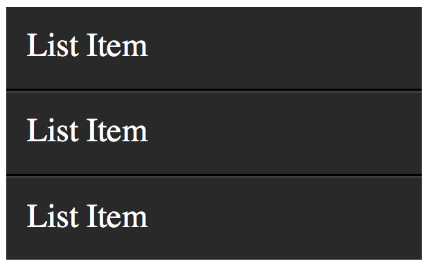
Let's build a simple example to demonstrate one possible use of these classes. We'll create a styled list item.Markup
1
2
3
4
5
| <ul> <li> List Item </li> <li> List Item </li> <li> List Item </li></ul> |
CSS
01
02
03
04
05
06
07
08
09
10
11
12
13
| ul { width: 200px; background: #292929; color: white; list-style: none; padding-left: 0;}li { padding: 10px; border-bottom: 1px solid black; border-top: 1px solid #3c3c3c;} |
ul, and apply borders to each li to provide a bit of depth.
To add depth to your lists, apply aThe only problem, as shown in the image above, is that a border will be applied to the very top and bottom of the unordered list - which looks odd. Let's use theborder-bottomto eachlithat is a shade or two darker than theli's background color. Next, apply aborder-topwhich is a couple shades lighter.
:first-child and :last-child pseudo classes to fix this.
1
2
3
4
5
6
7
| li:first-child { border-top: none;}li:last-child { border-bottom: none;} |
View Demo
Compatibility
- IE9+
- Firefox
- Chrome
- Safari
- Opera
:first-child, but not :last-child. Go figure. 28. X:only-child
1
2
3
| div p:only-child { color: red;} |
only-child pseudo class too often. Nonetheless, it's available, should you need it.It allows you to target elements which are the only child of its parent. For example, referencing the snippet above, only the paragraph that is the only child of the
div will be colored, red.Let's assume the following markup.
1
2
3
4
5
6
| <div><p> My paragraph here. </p></div><div> <p> Two paragraphs total. </p> <p> Two paragraphs total. </p></div> |
div's paragraphs will not be targeted; only the first div. As soon as you apply more than one child to an element, the only-child pseudo class ceases to take effect.View Demo
Compatibility
- IE9+
- Firefox
- Chrome
- Safari
- Opera
29. X:only-of-type
1
2
3
| li:only-of-type { font-weight: bold;} |
uls, which have only a single list item. First, ask yourself how you would accomplish this task? You could do
ul li, but, this would target all list items. The only solution is to use only-of-type.
1
2
3
| ul > li:only-of-type { font-weight: bold;} |
View Demo
Compatibility
- IE9+
- Firefox 3.5+
- Chrome
- Safari
- Opera
30. X:first-of-type
Thefirst-of-type pseudo class allows you to select the first siblings of its type. A Test
To better understand this, let's have a test. Copy the following mark-up into your code editor:
01
02
03
04
05
06
07
08
09
10
11
12
| <div> <p> My paragraph here. </p> <ul> <li> List Item 1 </li> <li> List Item 2 </li> </ul> <ul> <li> List Item 3 </li> <li> List Item 4 </li> </ul> </div> |
Solution 1
There are a variety of ways to solve this test. We'll review a handful of them. Let's begin by usingfirst-of-type.
1
2
3
| ul:first-of-type > li:nth-child(2) { font-weight: bold;} |
Solution 2
Another option is to use the adjacent selector.
1
2
3
| p + ul li:last-child { font-weight: bold;} |
ul that immediately proceeds the p tag, and then find the very last child of the element.Solution 3
We can be as obnoxious or as playful as we want with these selectors.
1
2
3
| ul:first-of-type li:nth-last-child(1) { font-weight: bold; } |
ul on the page, and then find the very first list item, but starting from the bottom! :)View Demo
Compatibility
- IE9+
- Firefox 3.5+
- Chrome
- Safari
- Opera
Conclusion
If you're compensating for older browsers, like Internet Explorer 6, you still need to be careful when using these newer selectors. But, please don't let that deter you from learning these. You'd be doing a huge disservice to yourself. Be sure to refer here for a browser-compatibility list. Alternatively, you can use Dean Edward's excellent IE9.js script to bring support for these selectors to older browsers.Secondly, when working with JavaScript libraries, like the popular jQuery, always try to use these native CSS3 selectors over the library's custom methods/selectors, when possible. It'll make your code faster, as the selector engine can use the browser's native parsing, rather than its own.
Thanks for reading, and I hope you picked up a trick or two!
Subscribe to:
Posts (Atom)